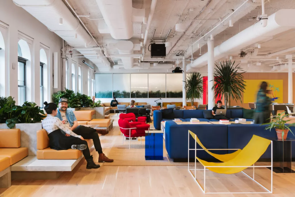
With a quarter million members in 283 buildings across 75 different cities (and another 183 locations in the pipeline), WeWork is on an expansion tear that’s grown to include retail, education, and maybe even full neighborhoods somewhere down the line. With the company’s first ground-up building, Dock 72, nearly complete in the Brooklyn Navy Yard, AN spoke with the designers and researchers who are making WeWork’s growth possible and tried to divine where the company is going next.
In a conversation on the future of data and workplace design at the William Vale Hotel in Williamsburg, Devin Vermeulen, creative director, and Daniel Davis, director of fundamental research, discussed how WeWork is “refining the future of the open office.”
Most architecture firms design offices as one-off projects and rarely collect feedback once the spaces are occupied, but because WeWork both designs and manages their co-working spaces, the company can collect post-occupancy data. Through the collection of data via user feedback and integrated sensors, the company has created a massive pool of information from which to build its design guidelines.
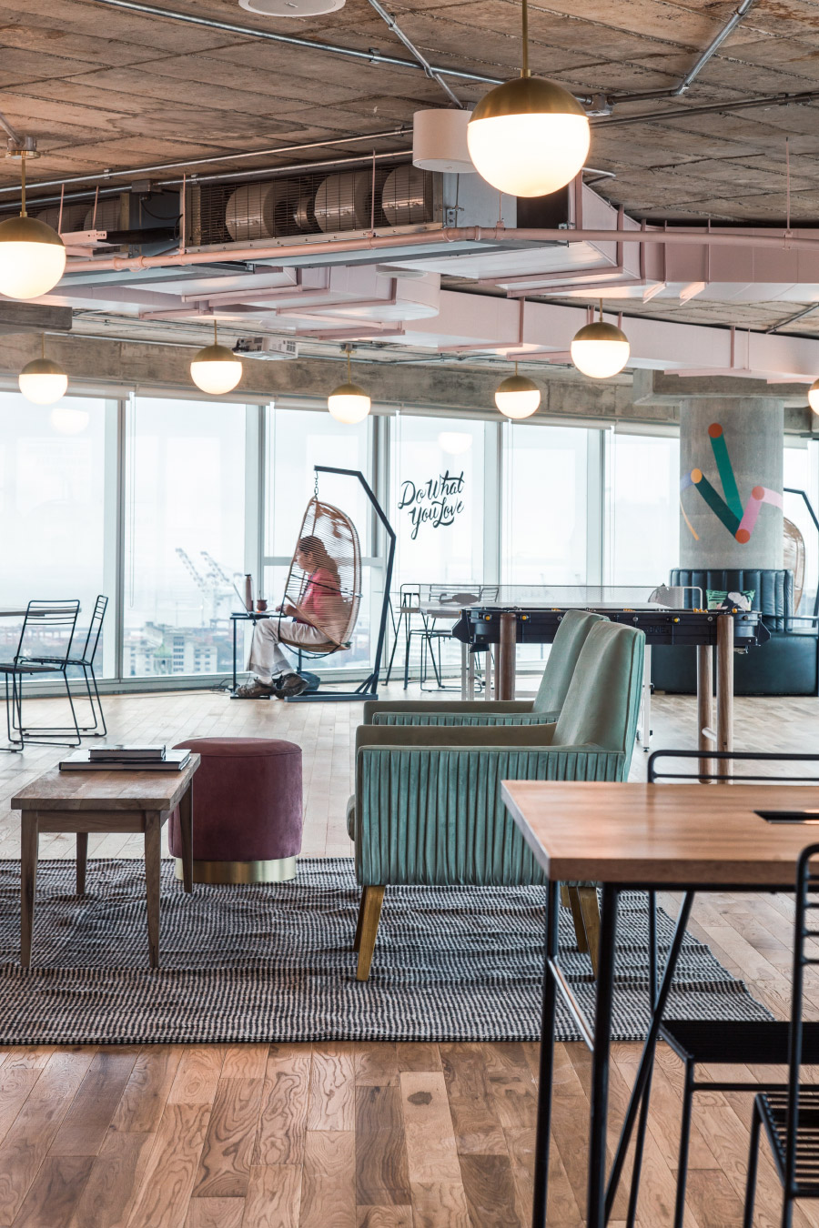
Planning a floor layout within the constraints of existing buildings can prove challenging, and WeWork is constantly tweaking and updating its offices based on tenant feedback. Every WeWork location outputs a massive amount of what Davis calls “data exhaust,” the information collected as a byproduct of tenants going about their day. Davis points out that data is just a proxy for user interaction, and the feedback collected through WeWork’s room booking app or surveys is just one metric of how their occupants feel.
The design of each location changes accordingly based on a user’s needs. Underutilized conference rooms can either be reconfigured to make them more appealing—cramped rooms can be reorganized, and dark rooms can be lit differently—or repurposed into different uses entirely. There’s no reason that a lesser-used conference room can’t be turned into a lounge if it draws tenants.
Feedback is aggregated and forms the core of WeWork’s design guidelines worldwide. The key to translating those guidelines across 22 countries is that, as the senior vice president and head of design at WeWork, Federico Negro, describes, only 90 percent of the guidelines are used across all offices. The remaining ten percent varies to adapt to local markets.
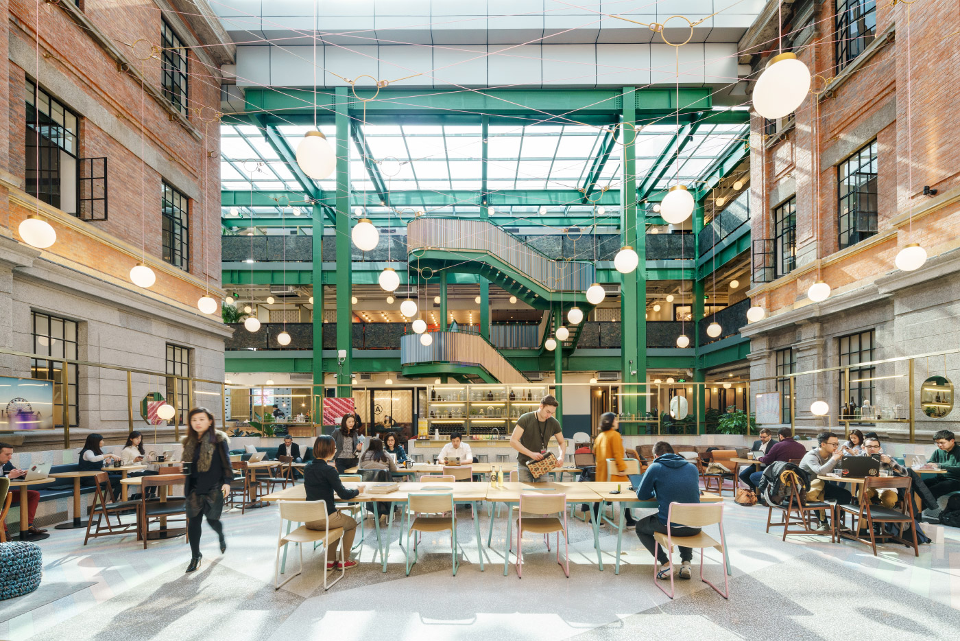
When WeWork expands into a new city or state, it hires local architects to adapt its traditional model. This might mean a long communal table in Scandinavian offices as everyone gathers to eat lunch together, or larger meeting rooms in China, where one-on-one meetings are eschewed for team gatherings.
The local architectural team is vertically integrated with the maintenance staff and utilizes feedback on trash routes, the ease of changing light bulbs, and other practical considerations when creating a layout. As hyped as the bromance between Bjarke Ingels and WeWork cofounder Adam Neumann has been, the Danish architect won’t be contributing much to the company’s day-to-day architecture work; the first “chief architect” will be focusing his attention on marquee projects like the WeGrow pilot school. The ultimate goal of the collaboration is to help WeWork expand into neighborhood planning, something outside of their current design scope.

WeWork’s furniture and lighting solutions may appear similar to what’s used in other spaces, but everything at WeWork is designed and fabricated by in-house teams. The resultant pieces are tested in WeWork offices, tweaked, and rolled out as kits-of-parts for designers to mix and match as they see fit.
On a recent visit to WeWork’s New York City headquarters in Chelsea, the sixth-floor lounge had recently been revamped with plants, technicolor couches, and custom lighting fixtures. The airy palette might have seemed novel to those familiar with the company’s darker coworking spaces of five years ago, but as WeWork grows and matures its aesthetic, what works in the headquarters will ultimately trickle down to its older locations. Negro describes the process as rolling out design like “software updates.”
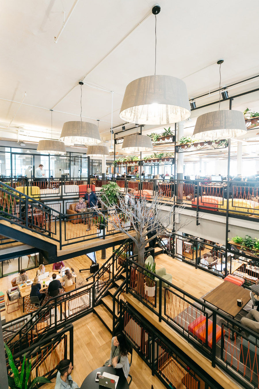
Circulation has been given special emphasis in the company’s design considerations, according to Davis. While his team’s algorithmically-generated desk layouts may optimize the number of seats in a WeWork office, guiding people to navigate those spaces in a certain way helps encourage face-to-face interactions. The most obvious intervention is the staircase; at the Chelsea location, the stairs have been relocated to the center of the floor and connect to floating “sky lobbies.” Each floor is anchored by its stair, and circulation flows around it out of necessity. That circulation can help guide and divide the energy of the floor, keeping raucous lounge get-togethers distinct from the more subdued private call booths or conference rooms.
The company is continuing to expand into both new industries and client groups. During the time of writing this story the company announced that it would be jumping into the real estate brokerage game with WeWork Space Services. Enterprise clients like IBM now compose 25 percent of WeWork’s tenants and represent a new design challenge for the company, but having core information from its prior tenants is helping the design team navigate the transition, said Negro.
As open offices continue to evolve, architects and interior designers have tweaked layouts and materials to optimize worker comfort and balance privacy concerns. Will the increasing availability of data help designers refine their solutions in the same way WeWork has done?
