If you’re reading this, there’s a good chance you won’t be visiting Venice any time soon. But that’s fine, neither will I. You might have heard that the 2021 Venice Architecture Biennale, one year delayed, kicked off in late May to significantly smaller crowds—and presumably a significantly smaller Aperol bill—than usual. You might have also heard that curator Hashim Sarkis’s Biennale centers around a question: How will we live together? The experience of the COVID-19 pandemic, and the stoppages in cultural production it brought about, has surely colored the responses. Numerous exhibitors, including the national pavilions in the Giardini and standalone teams at the Arsenale, have produced ways for audiences to engage with their projects from afar, online or otherwise. In this way, Sarkis’s Biennale differs from its predecessors in its messaging, but also in its media.
Here, AN has singled out projects that can be enjoyed and experienced without any knowledge about what’s been built in Venice:

Explore
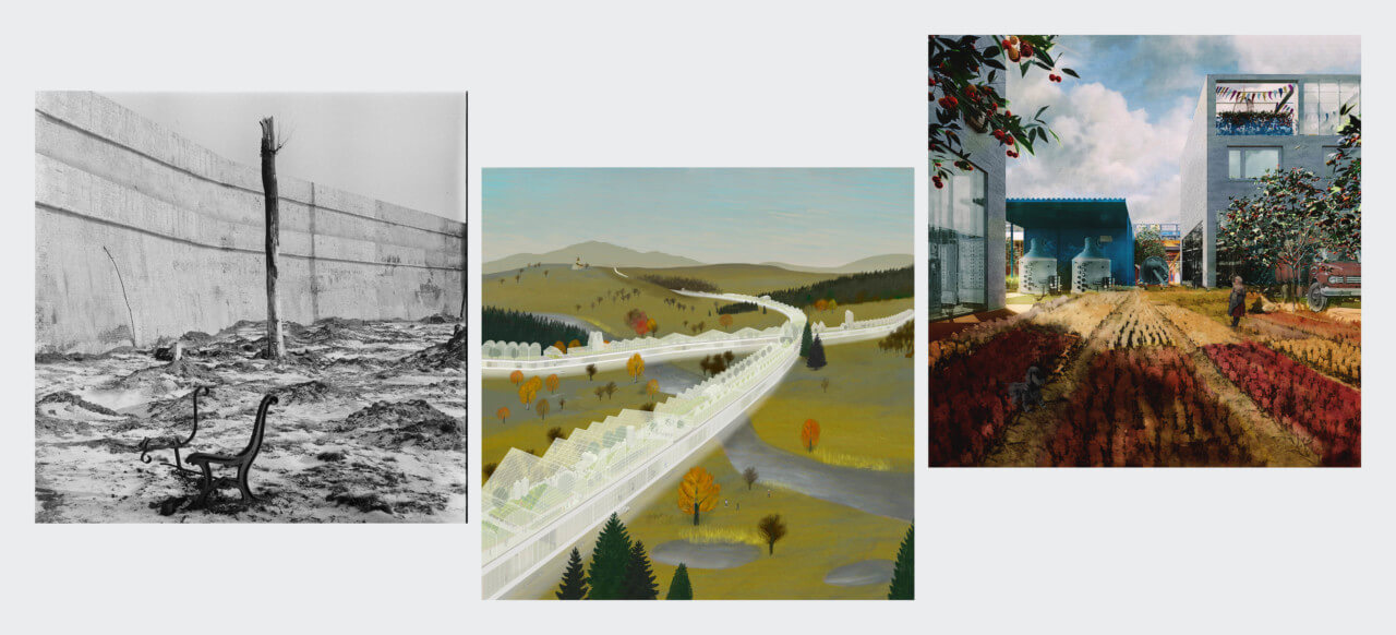
Some of the Biennale’s most successful virtual offerings are those that question the nature of exhibition-making, which continues to be centered around physical objects. At the top of the heap is the Polish pavilion’s Trouble in Paradise, which considers the design of the countryside in the central European state. The exhibition’s website is a delight and features an easily navigable panorama, in fact a collaged rurality peppered with annotations about artifacts (church steeples, barns, benches), points of communality (long-lasting social clubs), and sinister development practices (“fief urbanism”). Proposals from a few northern European design offices—selected by PROLOG, the Wrocław-based architecture office that curated the pavilion—proffer ironic visions of future village life. The text is a little scant at times, but the balance of interactivity and simplicity sets an example that others would do well to follow.
Similarly effective is Catalog for the Post-Human, an installation from the Biennale’s central exhibition by British designers Parsons & Charlesworth, which presents a bleak, satirical series of “human enhancement products for today’s nomadic contractor.” The project’s microsite allows you to “handle” fictional commodities and augments promising to boost their user’s digital marketability (the ClickBaitWear LED bodysuit), promote self-care (microdosing kits and probiotics soil pops), and optimize performance (brain tablets)—everything the harried freelancer might need in their pursuit of the hustle. The Catalog pre-existed the Biennale, but the site feels fresh and, importantly, is fun to use.

Read
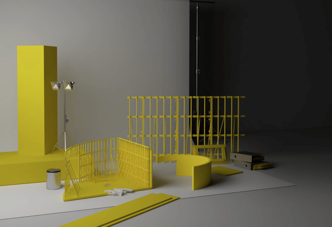
The past criticism of architectural biennials is that they too often follow the format of a book rather than, say, that of an exhibition—an impression aided by the overproduction of catalogs that attend every such event. Unsurprisingly, this same editorial bias runs through many of this year’s virtual offerings. For example, the Turkish pavilion’s Architecture as Measure assembles essays, interviews, and other “paperwork” that critique architecture’s role in normalizing “protocols of extraction, maintenance, logistics, and construction,” as curator Neyran Turan put it to me. Organizers began collecting the materials—again, they vary in format and include digital dioramas by NEMESTUDIO, Turan’s Bay Area-based design practice—in April 2020, with plans to continue publishing over the course of the Biennale’s run. “This longer-term publication has a slower pace compared to a more typical exhibition catalog released at the opening,” said Turan. “People get involved in the project at different entry points and at different speeds.”
Open, the Russian pavilion project, preceded the Turkish pavilion’s publishing by a couple of months. In February 2020, curator Ippolito Pestellini Laparelli launched an editorial platform to investigate the “public role…of cultural institutions”, as he puts it in the Editorial, that has since gone one to publish texts by the likes of philosopher Timothy Morton and design curator Paola Antonelli. “It was almost as if one could receive a letter, every week, for one year: an intimate gesture, with an evident political meaning,” Pestellini Laparelli said to the AN. “It was a non-invasive and subtle strategy in contrast with the streaming bulimia we have experienced throughout the past months.” Less subtle is the website design, which, while clean and colorful, is encumbered by pop-ups that make extended browsing a little annoying.
More limited in scope, but still worth a web visit, is the Finnish pavilion’s New Standards, which delves into the history and legacy of a prefabricated wooden house company. Case studies and a few short essays communicate an important model of sustainable, high-quality mass housing.

Watch
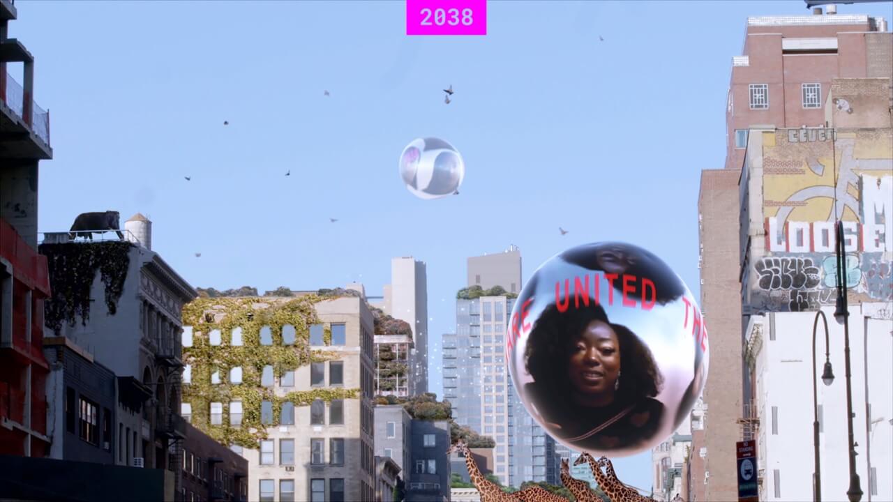
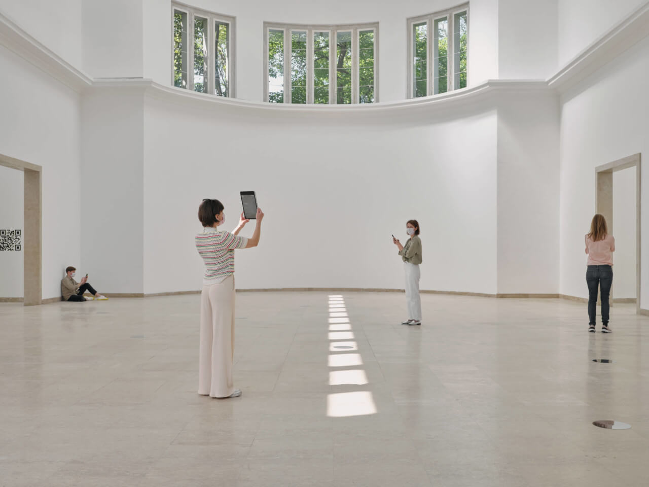
Film is another medium that translates easily from gallery wall to web browser, and it is central to a number of the digital pavilion displays. “Unlike traditional architectural media such as drawings, models or photographs we think that films have unique potentials to draw you into a specific narrative,” explained Nikolaus Hirsch, co-curator of the German pavilion. The exhibition centers around a fictional documentary set in the year 2038, by which point humanity will have “mastered the great crises,” the project text announces. Viewable on the German pavilion’s website or accessed via VR codes stamped on the walls of its physical pavilion, 2038 is conceptually rich and has very high production values, but it suffers from its fragmented and overcomplicated presentation.
Who Is We? at the Dutch pavilion attempts to critically interpret the “we” of Sarkis’s prompt, investing its implied collective with a more pluralistic understanding of humanity and its spatial interactions with other species. For curator Francien van Westrenen, the exhibition “offers a lens to see the relations between yourself and the other, between yourself and the world around you, and what is necessary to create those relations, which is polyphony and multiplicity.” As with a few others, the overdone UX design gets in the way of the work at times, but the videos, in particular Afaina de Jong’s Cruisekade film, are well worth your time.
Listen
Considering how effective sound can be for shaping spatial experiences, there were disappointingly few audio pieces produced for the Biennale. In what seems to be the sole exception, the Catalonian pavilion project air/aria/aire, a study of air pollution in Barcelona, commissioned a new EP by electronic musician Jon Talabot. Featuring vocals by singer Maria Arnal, the record is less ethereal than the subject matter might suggest, even bordering on the boisterous. This would seem to match the pavilion’s self-description, which characterizes the “polyphonic aria” as an activist piece “question[ing] who the air belongs to and who is responsible for safeguarding it.”
An interesting analog approach to virtual Venice comes from Justinien Tribillon, whose Welcome to Borderland installation in the Biennale’s main exhibition is “a celebration of plants’ migration, of their hybridity and capacity to adapt and resist,” as Tribillon says. Its website is exceedingly simple, comprising a single essay and, strangely, an order form: For a low price, web visitors can order a piece of the installation—comprising 120 A2 monochrome prints of plants—which will be dismantled into over 1700 postcards by Tribillon and mailed out when the Biennale closes in November. Beyond the gimmick, Tribillon sees the project as a critique of the –ennial model as a whole. “I think we, the individuals and organizations who participate or attend such events, are very much aware that they are not sustainable in their present form: socially, intellectually, environmentally,” he told AN. “How can we invent new forms, new gestures, that extend, in space and in time, the formidable energy created by the Biennale, but that don’t require us to board a plane and travel halfway across the world for three days in Venice?”
Tribillon’s query is timely and highly welcome. While I’m as sick of Zoom and Teams as the next person, the push towards centering online experiences of exhibitions, events, and other cultural formats has been one of the pandemic’s silver linings. In the past year, great designers have put their energies into digital, remote experiences, some of which have been every bit as rewarding as those found in physical galleries—the recent Archipelago: Architectures for the Multiverse conference being one such example. It shouldn’t have taken a pandemic to bring about this realization, and while I feel that too many virtual platforms continue to ape IRL experiences, this year’s event hinted at a change in attitudes. Nikolaus Hirsch summed it up well: “If the Venice Biennale really is the most important platform for architecture, then it must challenge its modes of accessibility and representation—and with it the very role of architecture.”
